Summary
On this project I contributed roughly equally to the research and design.
- Conducted ethnographic research and task analysis to understand users and their domain, and to find gaps between users’ goals and what their legacy system provided.
- Iteratively created wireframes based on insights from ongoing user research.
- Performed usability testing, including heuristic evaluations and paper prototype and interactive prototype testing.
- Collaborated with developers and a visual design team.
Project Background
The client needed an update to their legacy charge tracking system, which was built on complex tabular views and spreadsheets. The new system–a full-screen web app–would allow users at different approval levels to create and modify charges, and change their approval status, in a way that was easier to learn, and faster and more efficient to interact with.
My role was to conduct user research and create designs for the new system.
Initial Research
We began the project by performing contextual inquiries, task analyses, and interviews in which we gained an understanding of…
- How the existing system worked.
- What were the different types of users, and their goals and pain points.
- Gaps between what the existing system did and what the users needed or would like it to do.
Findings from these investigations were turned into…
- A journey map.
- An initial set of wireframes.
- An information architecture or site map.
- A list of requirements, broken down into project milestones, further broken down into a prioritized list of user stories that informed the development.
Design Iterations
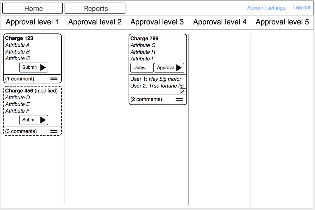
Ongoing user research (including interviews, wireframe reviews, paper prototype tests, heuristic evalutions, and remote usability tests using interactive prototypes) led to new ideas and iterations on the design for the “Dashboard” screen. Whereas the first version of the Dashboard wireframes showed each charge as a list item with a visualization of its approval status, the new version used approval level as the primary organizing factor for the layout. Charges were shown as distinct “cards” that moved across the screen as they were approved.
Outcome: Value Added
Beyond replacing a complex, tabular-style interface with an easy-to-learn and -use graphical one, the new system offered design improvements fed by the research we conducted. Two notable improvements were:
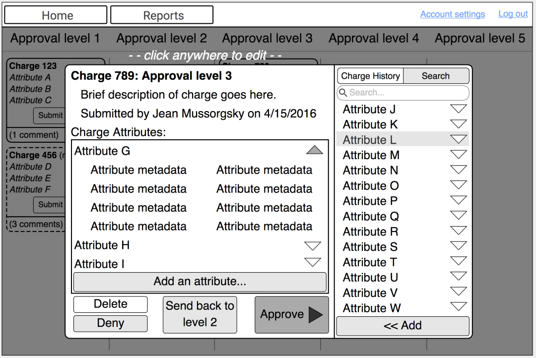
- Consolidation of all the various components of a charge into a single object that could be sent (and easily tracked by eye) through the approval process. This way users did not have to keep tabs on the many dispersed components of a charge. We arrived at this solution when we learned that a charge could not pass through the final approval stage until all its components were also approved.
- Inclusion of charge-related comments at the Dashboard and Charge Detail level in the system. From our initial inquiries we learned that users communicated via separate means, such as email, the changes needed in order to move a charge through the approval process. Juggling the charge tracking system and these separate means of communication was cumbersome and error-prone, and we resolved that issue by integrating comments into the system.
To perfect the new system’s look and interactivity, we collaborated closely with not only the front-end developers, but also with a visual design team.
In feedback sessions, users expressed excitement and gratitude when they saw and interacted with the new system (even as a prototype), which they said would be easy to learn and would save them a lot of time. We assured them that credit was due in large part to themselves, for providing such great input!
